J-Challenge 1 Winners
Congratulations to the J-Challenge 1 Winners! There were two categories for entry: photography and caption writing and social media marketing. See the names of the winners, their submissions, and feedback below.
Photography and Caption Writing Winners
First Place: Megan Fox with Willarko Yearbook at Willard High School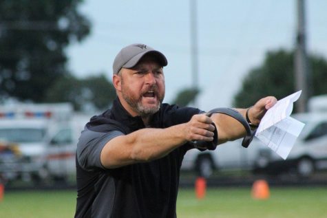
Feedback: There is so much emotion in this photo! You do a beautiful job focusing in on the reaction in the moment as well as paying attention to your background. Without careful attention, the poles in the background directly behind the coach’s head would have been an easy distraction; excellent work avoiding that situation! The blurred background (low aperture) also significantly helps this photo. Had you shot at a higher aperture, the background with all the cars would have pulled attention away from the subject. With the right amount of aperture blur, the viewer draws immediately to the subject of this photo. Great job cropping this photo appropriately too! Your exposure is also spot on. Excellent work!
Second Place: Sarah Allen with Willarko Yearbook at Willard High School
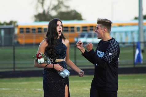
Feedback: There is such storytelling emotion in this photo! You do such a beautiful job capturing this moment. I would crop this photo just a bit more by cutting the line off on her mid-thigh. Avoid cropping subjects at the neck, top of the hips, knees, and ankles. I would also recommend cropping the sides in just a bit so that the girl falls on a rule of thirds line: this would help draw the reader’s eye to her even more. Your exposure is great!
Third Place: Sarah Voyles with Tribal Studios at Willard High School
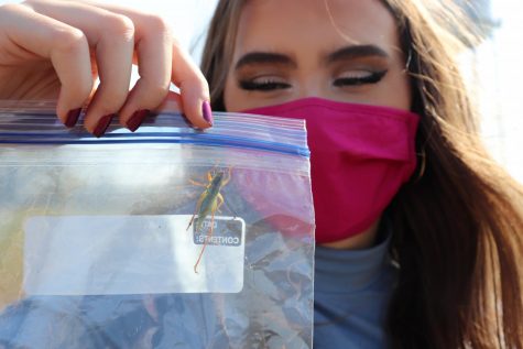
Feedback: This image is so fun! Your exposure and focus are great! Technically, this photo is great. The only reason this photo took third place compared to the other two photos is because of the more story-telling and emotional impact of the other two. In the nature of competition, a photo can do everything technically correct, but if it does not carry emotion, it makes it harder to stand in comparison to other submissions: this has been a lesson I have learned many times in my own submissions into contests.
Way to take home the wins Willard High School!
Social Media Marketing
First Place: Jaidan Key with Willarko Yearbook at Willard High School
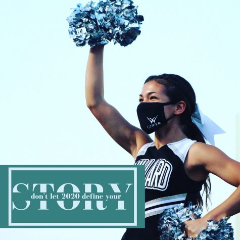
Feedback: This is a great, creative graphic design to draw in an audience. I love how “Don’t let 2020 define your” interrupts Story as interruption is a pretty heavy theme of 2020. However, even with the nature of the interrupting graphic design, there is the encouraging message to keep going. The featured photo demonstrates this message and reminds students the year is still going. Also, choosing a subject wearing a face mask helps push the message even further: even though this year feels so different, we’re going to keep making our own story. My only suggestion for this graphic would be to avoid cutting off her elbow. One suggestion on how to make this work for a square graphic would be to draw the photo in and have a border.
Second Place: Aidan Manns with LHS Spectator at Liberty High School
YouTube video link here.
Feedback: This is such a fun video that pays tribute to all the Rocky films, which feels very relevant to the year – it is nice to be reminded of the underdog fight. I would recommend some type of yearbook reference at the beginning of the video rather than the blue screen intro. A viewer may struggle to get the tie-in until the end.
Third Place: Sarah Voyles with Tribal Studios at Willard High School
YouTube video link here.
Feedback: This is a fun shout-out from your program to a student, which helps encourage and promote students. Great way to make your school community feel involved! The design struggles a bit. The background feels random and the font does not have strong design purpose. I would consider a more minimalistic background (maybe just a solid black) and a simple sans serif font that avoid slanting.


